


The CGE logo, comprised of a symbol, calligraphic Chinese characters, and English words. The symbol is an annulus with the acronym “CGE” decorated at the middle and embraced by two arcs. This design is inspired by the skyline and the traditional Chinese philosophy “Round Heaven and Square Earth”. The annulus also symbolizes the enterprise’s momentum of development, global vision and foresight.
The four calligraphic Chinese characters on the logo are distinctive, vigorous, firm, simple and unrestrained. The red color of the characters signifies the confidence, persistence, enthusiasm, and future commitment of the enterprise. This prudent and passionate color also reflects the enterprise’s corporate spirit of loyalty, sincerity, diligence and innovation.
The CGE logo, with all parts in great harmony with each other, is prudent yet energetic, traditional yet modern.


The second generation China Grand Enterprises’ logo design is inspired by the infinity symbol "∞". The Latin of this symbol is "infinitas", which means "without boundaries". This coincides with the meaning of corporate name, and can reflect the infinite ambitious pursuit for the future business.
The second generation logo marks the basis of the infinity symbol and sublimate "China Grand Enterprises" unique qualities. The stability and pithiness reflect the company's pragmatic style and strong sense of responsibility; the graceful arc and lines highlight the business excellence; the open style and soft-colored halo express the "China Grand Enterprises" people-oriented care and consideration; blue reflects the company's strengths and vision. The overall design, bold and agile, suggests that enterprise will bring to public full of infinite inspiration with its own vitality.
The second generation corporate identity of "China Grand Enterprises" fully embodies its renewed brand philosophy, "Solid practice and cultivation shall enlighten a quality and inspiring future". This firm, elegant, timeless identity shall not only lead us to reach a infinitely better future, but also lead us beyond ourselves, and beyond the future.

The first generation China Grand Enterprises logo stands for "hand in hand to create a new world". The design was inspired by the shape of a "hand", and reflects the core philosophy of the enterprise with a modern aesthetic touch.
Hand, part of the human limbs, is also a symbol of wisdom and creation. In Chinese word roots, hands can be elaborated into the meanings as means, manual, expert, hands-on, hand in hand, etc. "Hand" has been extensively used in our daily life, and has obviously inspired human behavior.
Hand, is a core factor of human survival and evolution. The first step of human evolution began by using hands. Hand is the eternal basis of human development. With hands, we can conquer beyond the limitations of all time.
The logo design uses the round frame, symbolizing the sun, the earth, the moon and other planets. It also means Limitless and Completeness. With holding up palms all through the round shape, from bottom to top, it is full of supporting energy, and expresses China Grand Enterprises’ philosophy as highly united and constant growing upward. The fingertips of the hand break open the round frame, leave an visual impression of breaking through the closed and limited sense and offer a feel of outgoing, and breakthrough visual effects. It is progressive and open, with a spirit as "Freely, fish enjoys a good swim in broad ocean, and bird soars in clean sky". "Hand" also symbolizes a person’s capability, and reflects the "people-oriented" business philosophy.
The logo has a deep philosophical and aesthetic meaning. It is simple, intuitive with a strong visual impact, and accurately conveys the corporate philosophy perfectly.
LATEST NEWS
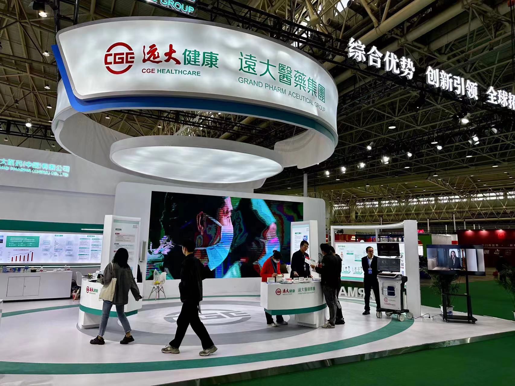
Grand Pharma brings heavyweight products to the World Health Expo
2023-04-12
Grand Pharma Recognized as a National Technology Innovation Demonstration Enterprise
2022-11-09
Globally innovative products Atectura® and Enerzair® developed by Grand Pharma officially enter the domestic market
2022-09-06
Accelerating Global Innovation, Opening Ceremony of Grand Pharma Optics Valley R&D Center and Extensive Intervention Production and R&D Platform
2022-08-24
SIR-Spheres® Yttrium-90 Microspheres Injections Introduced by Grandpharma Officially Launched in Chinese Market
2022-06-22
Yuanda Shuyang's New Production Base for Blood Products Officially Put into Operation
2022-04-15
 (86-10)84891818
 info@cgeinc.com
Copyright © 2017-2021 China Grand Enterprises, Inc.
Beijing ICP No.10014261-2
 Beijing Public Network Security No.11010502033526
Site Map
|
Contact Us
|
Legal Statement
|
Copyright Statement


