Recently, China Grand Enterprises (CGE) officially launched its new logo. The new logo, in a color named as “China Grand Enterprises Red”, is comprised of the enterprise’s Chinese name, which is written in a traditional calligraphic style, and an annulus decorated with the acronym of the enterprise’s English name, which can better demonstrate the features of the enterprise.

The CGE logo, comprised of a symbol, calligraphic Chinese characters, and English words, is proof of the enterprise’s goal of sustainable development and strategy of globalization. The symbol is an annulus with the acronym “CGE” decorated at the middle and embraced by two arcs. This design is inspired by the skyline and the traditional Chinese philosophy “Round Heaven and Square Earth”. The annulus also symbolizes the enterprise’s momentum of development, global vision and foresight.
The four calligraphic Chinese characters on the logo are distinctive, vigorous, firm, simple and unrestrained. The red color of the characters signifies the confidence, persistence, enthusiasm, and future commitment of the enterprise. This prudent and passionate color also reflects the enterprise’s corporate spirit of loyalty, sincerity, diligence and innovation.
The CGE logo, with all parts in great harmony with each other, is prudent yet energetic, traditional yet modern.

China Grand Enterprises, Inc. (hereinafter referred to as CGE), established in 1993, is a joint-stock group company, headquartered in Grand Place, Beijing. As an investment company engaged in operation and management, CGE's core businesses cover pharmaceuticals and healthcare, commercial trade business, property investment, financial services and other industries.
LATEST NEWS
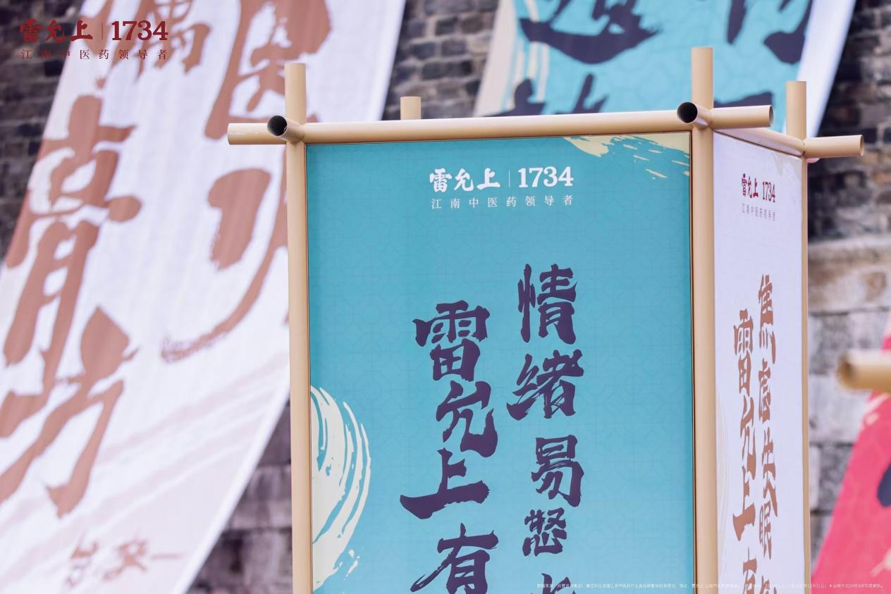
Lei Yunshang Herbal Paste Festival: A Perfect Fusion of Tradition and Innovation, Ushering a New Trend in TCM Wellness
2024-11-12
Grand Shopping Center’s Platinum VIP Event Achieves Over RMB 135 Million in Single-Day Sales Across 100 Brands
2024-11-12
Sinclair Sets Sail at WEM 2024 Global Medical Aesthetics Summit Leading the Future of Global Anti-Aging
2024-11-12
Grand Pharma’s LUCI: China’s First Adjustable Intracranial Stent Retriever Receives Medical Device Registration Certificate
2024-11-12
Second Generation of ELLANSÉ® Makes Stunning Debut at Sinclair’s New Product Launch
2024-07-10
Grand Pharma brings heavyweight products to the World Health Expo
2023-04-12
 (86-10)84891818
 info@cgeinc.com
Copyright © 2017-2021 China Grand Enterprises, Inc.
Beijing ICP No.10014261-2
 Beijing Public Network Security No.11010502033526
Site Map
|
Contact Us
|
Legal Statement
|
Copyright Statement
